|
02-07-2016, 01:15 AM,
|
|
|
Strela

Lieutenant General

|
Posts: 1,820
Joined: Oct 2008
|
|
Everything you never wanted to know about colourised graphics in Panzer Battles
Hi,
I was labouring on something today when someone looked over my shoulder asked me what I was doing and thought it was quite cool. I was in the process of colourising a photo and once I finished I thought I'd post the process up here.
This is something I have touched on in the Designers notes, but I thought I'd post a little more detail so you understand what goes into the images in game.
What’s involved in creating a single graphic in game…..
Here we have found a public domain image from the Australian War museum. This soldier is a member of New Zealand’s 28th (Maori) Battalion. Photo choice is harder than you think. Ideally, the subject should be facing the camera and have the body to at least waist height unimpeded by any other figure or terrain. Ideally, if a combat figure it is carrying an appropriate weapon.
![[Image: PB%20Graphics%20429.jpg]](https://www.theblitz.club/uploads/files/807/PB%20Graphics%20429.jpg) To paint a figure, you need a paint program that provides layering and blending. Adobe’s Photoshop is probably the best known program, but there are plenty of free programs available. I use the excellent RealWorld Paint (do a web search) – it has every feature I need.
The next step is to start painting our figure. The method that is simplest is to create a layer for each colour. It’s easy then to stack layers on top of the black and white photo and adjust and change each individual colour. By using a separate layer, the artist minimises errors and can easily change colours that aren’t quite right.
The best way to get the ‘right’ colours is to find a colour photo that has equivalent shading. I always start with the skin first and I used the below image to copy some representative skin. In this case taking a section from the cheek or arm is sufficient.
To paint a figure, you need a paint program that provides layering and blending. Adobe’s Photoshop is probably the best known program, but there are plenty of free programs available. I use the excellent RealWorld Paint (do a web search) – it has every feature I need.
The next step is to start painting our figure. The method that is simplest is to create a layer for each colour. It’s easy then to stack layers on top of the black and white photo and adjust and change each individual colour. By using a separate layer, the artist minimises errors and can easily change colours that aren’t quite right.
The best way to get the ‘right’ colours is to find a colour photo that has equivalent shading. I always start with the skin first and I used the below image to copy some representative skin. In this case taking a section from the cheek or arm is sufficient.
![[Image: PB%20Graphics%20430.jpg]](https://www.theblitz.club/uploads/files/807/PB%20Graphics%20430.jpg) I paste the section of copied skin onto a new layer I’m going to paint (I always name them so I remember what it is!) and then after selecting the paint brush tool, I use 'Sample Colour' to automatically pick the right brown. I then colour in the exposed skin.
Paintbrush tool selection
I paste the section of copied skin onto a new layer I’m going to paint (I always name them so I remember what it is!) and then after selecting the paint brush tool, I use 'Sample Colour' to automatically pick the right brown. I then colour in the exposed skin.
Paintbrush tool selection
![[Image: PB%20Graphics%20431.jpg]](https://www.theblitz.club/uploads/files/807/PB%20Graphics%20431.jpg) Paintbrush options
Paintbrush options
![[Image: PB%20Graphics%20432.jpg]](https://www.theblitz.club/uploads/files/807/PB%20Graphics%20432.jpg) Painted layer
Painted layer
![[Image: PB%20Graphics%20433.jpg]](https://www.theblitz.club/uploads/files/807/PB%20Graphics%20433.jpg) Layer Display
Layer Display
![[Image: PB%20Graphics%20434.jpg]](https://www.theblitz.club/uploads/files/219/PB%20Graphics%20434.jpg) The next step is to blend our newly painted layer with the original image. There is a blending tab with different methods as well as an opacity selection. Essentially opacity determines how much impact the current layer has on the original photo. I usually find that ‘Replace Colour’ or ‘Overlay’ give me the best results.
The next step is to blend our newly painted layer with the original image. There is a blending tab with different methods as well as an opacity selection. Essentially opacity determines how much impact the current layer has on the original photo. I usually find that ‘Replace Colour’ or ‘Overlay’ give me the best results.
![[Image: PB%20Graphics%20435.jpg]](https://www.theblitz.club/uploads/files/219/PB%20Graphics%20435.jpg) For our initial skin layer, Replace Colour at 100% opacity has the following impact;
For our initial skin layer, Replace Colour at 100% opacity has the following impact;
![[Image: PB%20Graphics%20436.jpg]](https://www.theblitz.club/uploads/files/219/PB%20Graphics%20436.jpg) I then complete the face with highlights for lips, cheeks etc as well as eye and hair colouring. The next major step is to do the figures uniform. Using incorrect colours here can really remove the historicity of an image. Normally, I try and find an appropriate photo of the uniform or equipment I am colouring. There is a huge amount of resource on the web and that makes it fairly easy to find appropriate images. The basis for my shirt and shorts colouring is the following genuine shirt/battledress. I can sample the colour and then paint accordingly.
I then complete the face with highlights for lips, cheeks etc as well as eye and hair colouring. The next major step is to do the figures uniform. Using incorrect colours here can really remove the historicity of an image. Normally, I try and find an appropriate photo of the uniform or equipment I am colouring. There is a huge amount of resource on the web and that makes it fairly easy to find appropriate images. The basis for my shirt and shorts colouring is the following genuine shirt/battledress. I can sample the colour and then paint accordingly.
![[Image: PB%20Graphics%20437.jpg]](https://www.theblitz.club/uploads/files/219/PB%20Graphics%20437.jpg) Once the uniform is painted I blend it using Overlay and a 70% opacity and get the following result. My aim is to have some weathering and hence the lighter colour.;
Once the uniform is painted I blend it using Overlay and a 70% opacity and get the following result. My aim is to have some weathering and hence the lighter colour.;
![[Image: PB%20Graphics%20438.jpg]](https://www.theblitz.club/uploads/files/219/PB%20Graphics%20438.jpg) You can see we’re starting to get quite a number of layers;
You can see we’re starting to get quite a number of layers;
![[Image: PB%20Graphics%20439.jpg]](https://www.theblitz.club/uploads/files/c8e/PB%20Graphics%20439.jpg) I add the final equipment as layers using various sources to get appropriate colouring. I finish with 9 layers in all to colour this photo. Note, the duplication of the helmet was done to get a darker image than what I started with. I essentially was able to double the impact and then scale it to what I wanted without having to find a darker colour;
I add the final equipment as layers using various sources to get appropriate colouring. I finish with 9 layers in all to colour this photo. Note, the duplication of the helmet was done to get a darker image than what I started with. I essentially was able to double the impact and then scale it to what I wanted without having to find a darker colour;
![[Image: PB%20Graphics%20440.jpg]](https://www.theblitz.club/uploads/files/c8e/PB%20Graphics%20440.jpg) Our painted image is complete and looks like the following. I didn’t paint the MP40 or binoculars as they were usually dark in colour and in the final image will probably not be seen. If I wanted a more gun metal look, I would blend some blue over the gun to lift it slightly. With no wooden stock there is no need to add anything further;
Our painted image is complete and looks like the following. I didn’t paint the MP40 or binoculars as they were usually dark in colour and in the final image will probably not be seen. If I wanted a more gun metal look, I would blend some blue over the gun to lift it slightly. With no wooden stock there is no need to add anything further;
![[Image: PB%20Graphics%20441.jpg]](https://www.theblitz.club/uploads/files/c8e/PB%20Graphics%20441.jpg) With the image finished, I ‘flatten’ the layers to create my base image. I usually work with PNG files and only convert to BMP’s at the final step for the game. It’s now time to cut out our subject and discard the remainder of the photo. This is fairly easy to do and this image in particular is quick as the subject is surrounded by a single colour background. With the image flattened, there is usually some benefit to adjusting contrast and possibly gamma to sharpen up an image. RealWorld Paint has some automated tools as well as the ability to manually adjust each value. After cropping and utilising ‘Automatic Contrast’ the final painted image looks like the below. Note the blue background is temporary and used to validate that all the background has been correctly cropped;
With the image finished, I ‘flatten’ the layers to create my base image. I usually work with PNG files and only convert to BMP’s at the final step for the game. It’s now time to cut out our subject and discard the remainder of the photo. This is fairly easy to do and this image in particular is quick as the subject is surrounded by a single colour background. With the image flattened, there is usually some benefit to adjusting contrast and possibly gamma to sharpen up an image. RealWorld Paint has some automated tools as well as the ability to manually adjust each value. After cropping and utilising ‘Automatic Contrast’ the final painted image looks like the below. Note the blue background is temporary and used to validate that all the background has been correctly cropped;
![[Image: PB%20Graphics%20442.jpg]](https://www.theblitz.club/uploads/files/c8e/PB%20Graphics%20442.jpg) With our graphic now painted and created it has to be shrunk to fit into the game. I use another product from RealWorld usually used for creating program icons. This is an excellent program as it has some great controls for resizing and has created some of the sharpest images I have seen to date. I usually run the graphic through the program and create 20 images of various size with the aim to create both the unit card and in the in-game counter. Here you can see some samples of the shrunk graphics in the Icon editor. The 150x150 image is what we will use for the unit card.
With our graphic now painted and created it has to be shrunk to fit into the game. I use another product from RealWorld usually used for creating program icons. This is an excellent program as it has some great controls for resizing and has created some of the sharpest images I have seen to date. I usually run the graphic through the program and create 20 images of various size with the aim to create both the unit card and in the in-game counter. Here you can see some samples of the shrunk graphics in the Icon editor. The 150x150 image is what we will use for the unit card.
![[Image: PB%20Graphics%20443.jpg]](https://www.theblitz.club/uploads/files/c8e/PB%20Graphics%20443.jpg) The next step is to remove any low opacity pixels left after the image reduction. Using a grey background layer that is merged and then removed prevents any issue with ‘halos’ around images. Here is the graphic ready to be put in game and before the grey background is removed;
The next step is to remove any low opacity pixels left after the image reduction. Using a grey background layer that is merged and then removed prevents any issue with ‘halos’ around images. Here is the graphic ready to be put in game and before the grey background is removed;
![[Image: PB%20Graphics%20444.jpg]](https://www.theblitz.club/uploads/files/0e0/PB%20Graphics%20444.jpg) The unit card graphic is placed onto a standard background with any additional graphics (in this case a flag) and saved in game as a BMP file. A few rules need to be followed such as remove the bottom three pixels and ideally position the top of the graphic at the top of the background. Centring is normally mandatory too.
The unit card graphic is placed onto a standard background with any additional graphics (in this case a flag) and saved in game as a BMP file. A few rules need to be followed such as remove the bottom three pixels and ideally position the top of the graphic at the top of the background. Centring is normally mandatory too.
![[Image: PB%20Graphics%20445.jpg]](https://www.theblitz.club/uploads/files/b30/PB%20Graphics%20445.jpg) Here is our finished graphic in game. We have experimented with a range of different looks here including extending below the unit name box, but that usually makes it more difficult to read the unit’s values.
Here is our finished graphic in game. We have experimented with a range of different looks here including extending below the unit name box, but that usually makes it more difficult to read the unit’s values.
![[Image: PB%20Graphics%20446.jpg]](https://www.theblitz.club/uploads/files/b30/PB%20Graphics%20446.jpg) The final step is to create the in game counter. Going back to the icon editor and selecting a smaller graphic starts the process. The graphic is then placed on a template with the Nato symbol and is cleaned up and cropped. Sizing of the image is important so that it is in scale to the images on other counters.
The final step is to create the in game counter. Going back to the icon editor and selecting a smaller graphic starts the process. The graphic is then placed on a template with the Nato symbol and is cleaned up and cropped. Sizing of the image is important so that it is in scale to the images on other counters.
![[Image: PB%20Graphics%20447.jpg]](https://www.theblitz.club/uploads/files/b30/PB%20Graphics%20447.jpg) Finally, the graphic can be seen on a counter in game;
Finally, the graphic can be seen on a counter in game;
![[Image: PB%20Graphics%20448.jpg]](https://www.theblitz.club/uploads/files/b30/PB%20Graphics%20448.jpg) The end result here is ok – but the shrunk image in the unit card has a bit of a zombie look to him (Michael Jackson’s Thriller anyone?). It’s mainly related to the shrunk image picking up the whites of the eyes that are accentuated due to the side glance of the subject. More fiddling to be done – so back to trying a few things here….
I hope this little tutorial gives you some idea how much work goes into every image. There can be up to an hour spent in the process per graphic and in many case images end up on the cutting room floor.
David
The end result here is ok – but the shrunk image in the unit card has a bit of a zombie look to him (Michael Jackson’s Thriller anyone?). It’s mainly related to the shrunk image picking up the whites of the eyes that are accentuated due to the side glance of the subject. More fiddling to be done – so back to trying a few things here….
I hope this little tutorial gives you some idea how much work goes into every image. There can be up to an hour spent in the process per graphic and in many case images end up on the cutting room floor.
David
|
|
|
|
02-07-2016, 01:28 AM,
|
|
|
Strela
Lieutenant General
|
Posts: 1,820
Joined: Oct 2008
|
|
RE: Everything you never wanted to know about colourised graphics in Panzer Battles
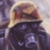
A little post script. Replacing the whites of his zombie eyes with a black pixel resulted in the following... Almost acceptable.
![[Image: PB%20Graphics%20449.jpg]](https://www.theblitz.club/uploads/files/89a/PB%20Graphics%20449.jpg)
David
|
|
|
|
02-07-2016, 01:59 AM,
|
|
|
Hadge
Grumpy Old Man

|
Posts: 173
Joined: May 2005
|
|
|
RE: Everything you never wanted to know about colourised graphics in Panzer Battles
I have been making some (very) minor changes to my graphics set for both BON and Kursk recently, and I have been increasingly impressed with the quality of the originals as presented "out of the box".
I just wanted to take a minute to give credit, and recognise David and the design/test team, for the massive amount of time and effort it must have taken to do the entire counter set, map, and rules in order to deliver the game as it is.
- applause for the guys please .... !
Cheers
Chris
|
|
|
|
02-07-2016, 02:49 AM,
|
|
|
Strela
Lieutenant General
|
Posts: 1,820
Joined: Oct 2008
|
|
RE: Everything you never wanted to know about colourised graphics in Panzer Battles
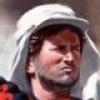
And what we will probably go with ... and faithful to the original image;
![[Image: PB%20Graphics%20450.jpg]](https://www.theblitz.club/uploads/files/097/PB%20Graphics%20450.jpg)
Hadge, thank you for the kind words...!
David
|
|
|
|
02-07-2016, 04:00 AM,
|
|
|
|
RE: Everything you never wanted to know about colourised graphics in Panzer Battles
A fabulous walk-through David.
Thanks for taking the time and effort to put all of that together as it was great to see all of the required steps.
I can't wait to start trying my hand at such a task.
Thanks Again!
|
|
|
|
02-08-2016, 05:57 PM,
|
|
|
DaveMic
Corporal

|
Posts: 53
Joined: Mar 2005
|
|
RE: Everything you never wanted to know about colourised graphics in Panzer Battles
A superb lecture on the coloring !!
Thanks monsieur "Henri Matisse" Strela !!! 
|
|
|
|
02-09-2016, 12:19 AM,
|
|
|
ComradeP
Lieutenant General
|
Posts: 1,553
Joined: Nov 2012
|
|
|
RE: Everything you never wanted to know about colourised graphics in Panzer Battles
Interesting to read a step by step process on how a unit image is created, the work required makes the recent art upgrades even more impressive.
|
|
|
|
02-10-2016, 05:19 AM,
|
|
|
Xaver
Brigadier General

|
Posts: 1,014
Joined: Jan 2008
|
|
RE: Everything you never wanted to know about colourised graphics in Panzer Battles
Great job, now i cant sleep after see the work you need to create the PzB zombies but i think you need an Igor with experience
Ummm you didnt notice the little "leak"??? 28th Maori btl 
|
|
|
|
02-10-2016, 03:41 PM,
|
|
|
Strela
Lieutenant General
|
Posts: 1,820
Joined: Oct 2008
|
|
RE: Everything you never wanted to know about colourised graphics in Panzer Battles
(02-10-2016, 05:19 AM)Xaver Wrote: Great job, now i cant sleep after see the work you need to create the PzB zombies but i think you need an Igor with experience
Ummm you didnt notice the little "leak"??? 28th Maori btl
If you think the 28th (Maori) Battalion is going to narrow things down for you good luck....!!!!
As far as artwork, it's a personal passion of mine. Getting Tiller's games up to a more modern state is very gratifying and you can assume I'll continue to try different things as we progress. Everyone's feedback has been really useful and the work I did on the 'small terrain mod' shows how quickly things can be adjusted. I'm obviously working on the next PzB title, but also looking to see what we can do with previously released PzC games to bring some of the current artwork enhancements to those titles.... Please keep the feedback coming, I appreciate it.
David
|
|
|
|


 Archived Forums
 Help
Help Calendar
 Member List
 Search
 Everything you never wanted to know about colourised graphics in Panzer Battles


![[Image: exercise.png]](https://www.tickerfactory.com/ezt/t/wVrvMz3/exercise.png)


)